
Selecting The Perfect White Paint Colour For You
WORLD OF COLOUR
By Belinda Blackburn - Property Stylist and Colour Consultant
One of the most important aspects when designing your home is selecting your colour palette. Through our Colour Consultation service, we know that when choosing paint colours, fabrics or finishes, colours have a substantial impact on the look and feel of your home while strongly influencing your emotions and well-being.
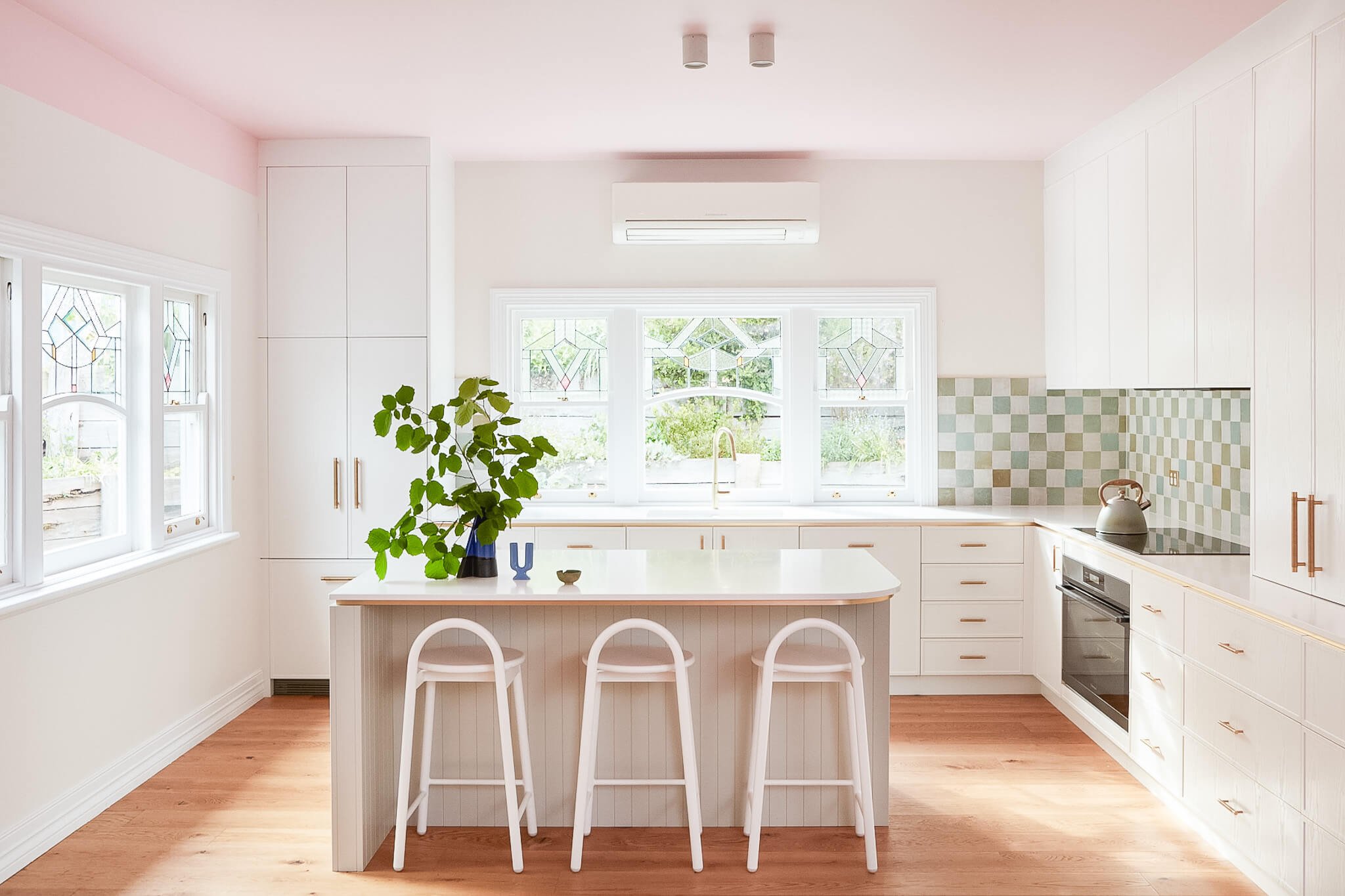
Wandi Valley House - Walls: Dulux Natural White Trims: Dulux Vivid White Ceiling: Haymes Junket Pink
Image by Simon Ferrito, 2024
Britt and I have been deep-diving into the world of colour, further building our knowledge of the hues, how and where to use them, and how they influence us and how others may perceive them. We’re always looking to improve our skills and have undertaken a course on colour psychology by renowned expert Sophie Robinson, as well as nonstop research—reading every book we can get our hands on. We are excited to put our passion to work in our enhanced Colour Consultation offering.
I could talk your ear off about all the colours and their pros and cons forever and a day, but let’s start with one that our clients are always asking about - White.
Leader Reef - Walls: Dulux Lexicon Trims: Dulux Lexicon Half Feature: Feast Watson Black Japan Stain, Gloss Finish
Image by Threefold Studio, 2023
Ok, it isn’t technically a colour (rather a lack of colour); however, tiny hints of colour alter white into warmer or cooler shades, and this is where our clients scream out for help. Which is the best white for your home? This is no small question, and there is no one answer. Colour is perceived differently in different light, be it natural or artificial, the time of day, whether the light hits the colour directly or indirectly, and the temperature of the light, known as it’s Kelvin rating.
When selecting the perfect colour for your home, we consider all of these factors, along with the feeling you are trying to create in the space, who will be using it and at what time of day, the mood you want to set, and the tasks that take place in each particular area.
We get it; it can be overwhelming.
Below, I will explain the basics of how a pure, cool and warm white may appear in different lighting conditions and their benefits and drawbacks (all colours have both) using three of Dulux’s most popular whites: Vivid White, Lexicon Quarter and Natural White.

Le Bain - Walls: Dulux Vivid White Trims: Dulux Vivid White
Image by Hannah Puechmarin, 2022
Aspect, Orientation & Undertones Explained
Aspect & Orientation: House orientation refers to the positioning of a home in relation to the sun and prevailing winds. Understanding the importance of house orientation when buying a house in Australia can greatly enhance your living experience. Whether you opt for a northern-aspect house with its abundance of natural light and warmth, a southern-aspect house that offers respite from the heat, a western-aspect house with captivating sunset views, or an east-aspect house that provides refreshing mornings, choosing the right orientation can significantly impact your comfort, energy efficiency, and overall enjoyment of your new home.
Pure White: White with neither a cool nor warm undertone (no tints added). These bright whites will pick up on the light and colours they reflect.
Cool White: White that has a black/green/blue tint added in varying degrees, creating a white with a hint of grey, blue, or green. These whites feel crisper and cooler and help to balance Western light (orangey sunsets). Cool whites feel modern and strong and have a higher Kelvin rating.
Warm White: White that has a yellow/red tint added in varying degrees, creating a white that has a more natural, brown or cream touch. These whites make you feel softer and warmer and therefore help balance cool light coming from the east (blueish morning light). They have a lower Kelvin rating.

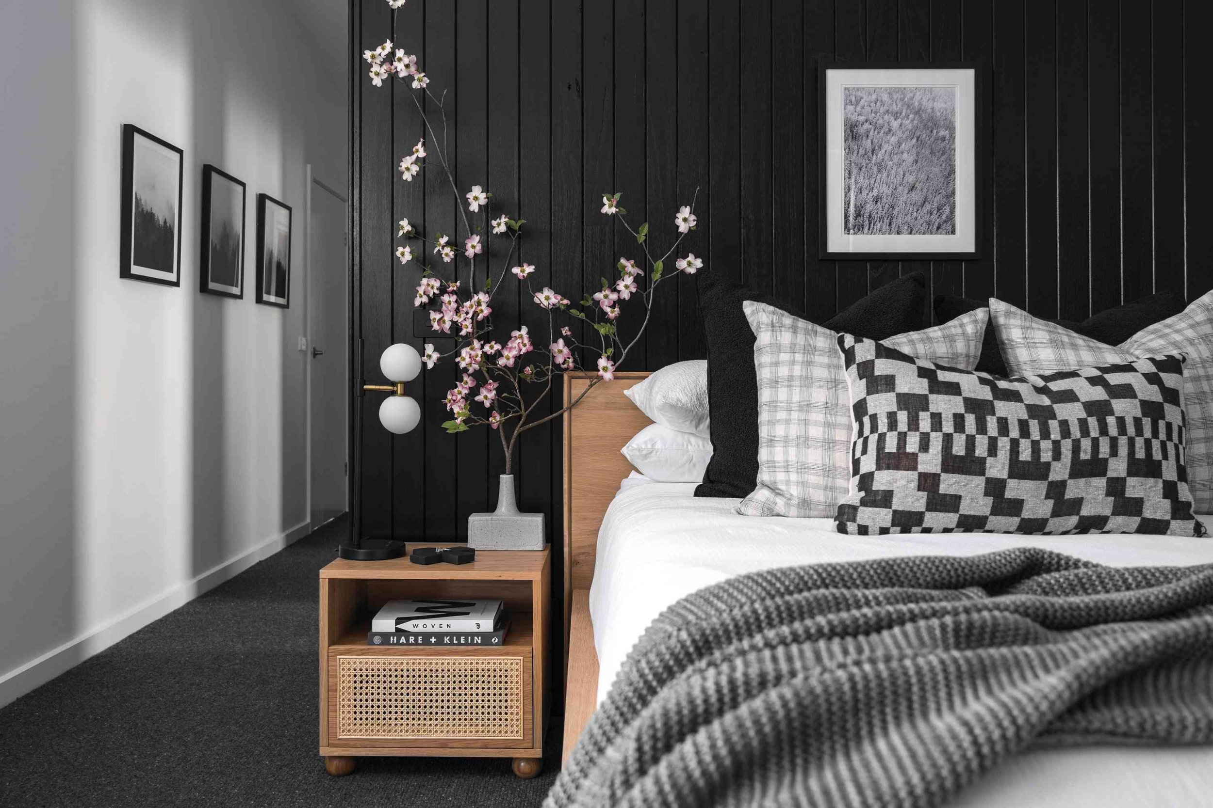
Le Bain - Walls: Dulux Vivid White Trims: Dulux Vivid White Ceiling: Dulux Vivid White
Image by Hannah Puechmarin, 2022
Dulux Vivid White
Vivid White is a perfectly true pure white, with no other pigments added to it, so it is neither warm nor cool. It is brilliant, clear and fresh and will bounce light around the room. A true blank canvas, Vivid White works as well with contemporary homes as it does with mid-century homes.
Pros: Vivid white is a bright, crisp and clean white as it reflects light well. It pairs well with all colours and has a timeless appeal. In warmer light (afternoon, with a southerly or westerly aspect), it will feel warm and uplifting.
Cons: In cool light (morning, with a southern and eastern aspect in the southern hemisphere), it can feel quite cold and sterile, perhaps even a bit too bright in some areas. To counteract these drawbacks, add warm materials and fabrics, like oak-coloured wood flooring, as these will help balance the feeling of the room.
We love to use Vivid White on ceilings, trims and architraves, as it injects a crisp, clean vibe without being overpowering.

Leader Reef - Walls: Dulux Lexicon Trims: Dulux Lexicon Half Ceiling: Dulux Lexicon Half
Image by Threefold Studio 2023
Dulux Lexicon
Lexicon Quarter is one of Dulux’s most popular cool whites, creating its shade by adding a minimal amount of black tint to a pure white base. This slightly grey undertone means that it pairs very well with cooler colours such as greys, greens and blues. This colour perfectly suits contemporary homes with strong architectural features.
Pros: Lexicon Quarter is a vibrant white that will help to bounce light around a room, which is great for open-plan living. It is uplifting and will accentuate your furniture and artwork by providing the perfect backdrop. In northern and western-facing rooms, it balances the warm light.
Cons: As with Vivid White, this colour may feel cold in southern and eastern-facing spaces in the southern hemisphere. Again, we like to counteract this with warm wood tones and inviting rugs.
Lexicon Quarter works great on gallery walls, ceilings and trims.

Wandi Valley House - Walls: Dulux Natural White Trims: Dulux Vivid White Ceiling: Dulux Vivid White
Image by Simon Ferrito 2022
Dulux Natural White
Our third white is Natural White, Dulux’s most popular white, and for good reason. Even though Natural White has a warm undertone, it is so slight that it can be used anywhere - the perfect neutral. The lightest option in Dulux’s warm whites section, Natural White is bright and fresh yet tranquil and soothing. It works beautifully in Victorian or Mid-century homes as well as coastal, alpine and contemporary weatherboard homes.
Pros: This hue is warm and inviting, reflecting light well and making spaces feel larger. Natural White balances cool light from the south and east and is perfect for those rooms with limited natural light. It has a soft, earthy presence and will complement many furnishing and material choices.
Cons: Warm light coming from the north and west will bring out the yellow undertone, making the space look cream.
Natural White looks great on walls, contrasted with Vivid White on the architraves and trims.

Le Bain - Walls: Dulux Vivid White Trims: Dulux Vivid White
Image by Hannah Puechmarin, 2022
Once you’ve decided whether you’d prefer a pure, cool or warm white, we recommend purchasing a sample pot and painting a large square in each room you intend to use the colour. Painting a section that is at least 500mm x 500mm with at least two coats will help give you a clearer indication of how the colour will look and feel in the space. Alternatively, paint a piece of cardboard the same size so you can move it around the house's rooms, seeing the paint colour in different aspects of light. Finally, pop back into the room at different times during the day to see how light at different levels affects the colour and the feeling you are looking to create.
Still need help selecting the perfect white?
We’re here to help. Our Colour Consultation service offers a quick turnaround on paint colour decisions, whether you want a neutral, earthy or vibrant palette. The sky is the limit!